

Judge a Book by Its Cover?
By Jacqueline Seewald
Does cover art draw readers? Any savvy writer will tell you that the first thing a reader notices about a book is the front cover. Maybe you can’t or shouldn’t judge a book by its cover, but it sure helps to have an attractive one that draws the eye of the reader. For new fiction authors, cover art can make or break the book. What kind of front cover grabs the reader’s attention? What kind of cover art should a book display?
Probably the first and most basic question to ask: is the book going to be sold on the shelf of a bookstore or is it going to be available only online? Is the novel going to be a hardcover, trade, paperback or e-book? Yes, it really does make a difference!
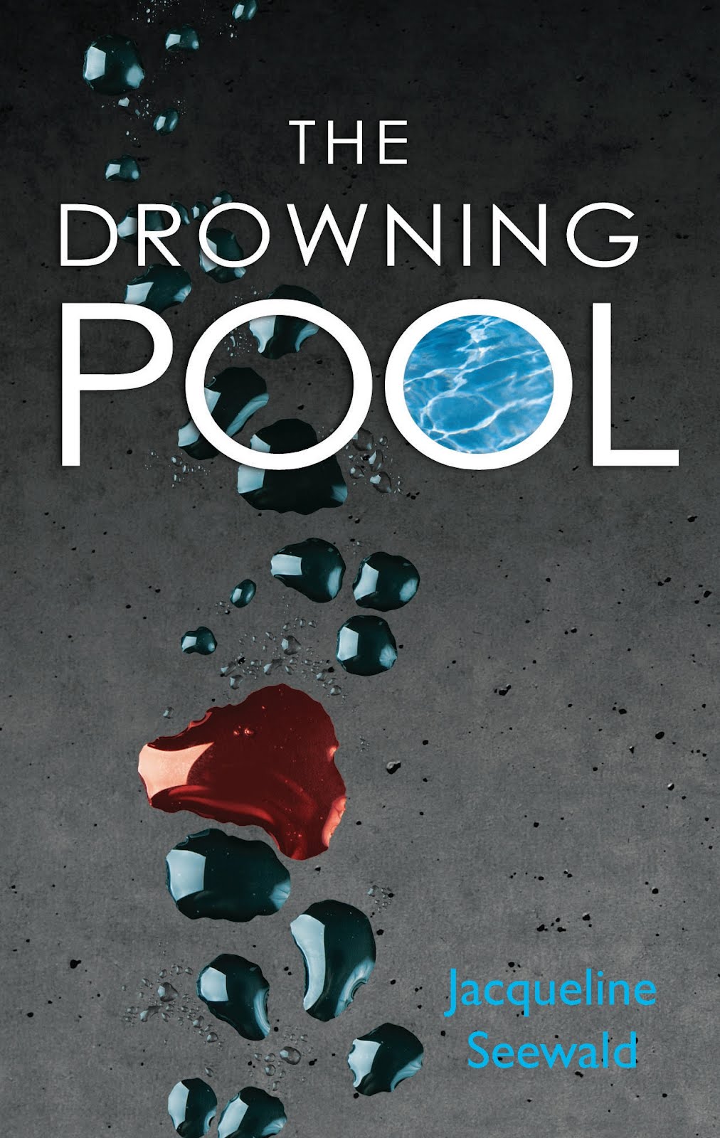
Let’s examine e-books. Online the cover is small, so you don’t want anything too fussy or busy. The old saying “less is more” works best for a book cover that sells online. A short title with a large, easily readable font and bright contrasting colors shows up best on the computer screen. You want to avoid covers that are complicated and hard to read. Plain, simple graphics are best. I’m pleased, for example, with the e-book covers L&L Dreamspell provided for three of my books now available in all e-book formats: THE INFERNO COLLECTION, THE DROWNING POOL and STACY’S SONG. http://www.lldreamspell.com/JacquelineSeewald.htm
Here’s t he e-book cover art for the first mystery in the Kim Reynolds librarian sleuth series:
Here’s t
 he e-book cover art for the first mystery in the Kim Reynolds librarian sleuth series:
 With hardcover fiction books, the cover also needs to fit the genre, be attractive, while the title still needs to be easy to read. THE TRUTH SLEUTH in hardcover is now available in large print from Thorndike/Kennebec and can be requested at libraries as well as Amazon and B&N online. It’s the third novel in my Kim Reynolds romantic mystery series. The cover art fits the plot of the novel perfectly. Five Star/Gale does respect input from its authors. For my upcoming April release from Five Star, DEATH LEGACY, I didn’t like the initial cover art. I explained my reasoning. Our editor came up with something much more appropriate. The same thing happened with TEA LEAVES AND TAROT CARDS. I explained that the woman in the period costume was dressed in Victorian style. However, the novel is set in the Regency era. I requested an immediate change in the cover art, and it was done.
Mystery or thriller novels are often dark and boding in appearance, appropriate to that genre while romance novels in hardcover often have flowery lettering and show an attractive man or woman. There is often a “money” quote on the front of hardcover books. This can be a blurb provided by another author or a partial review from a publication. It should offer praise for the writer’s work.
Paperback covers need simplicity just as e-book covers do. The artwork should support the title and the genre. Here’s the cover art for the paperback version of The Drowning Pool which Harlequin Worldwide Mystery has published as a reprint for February 2012. Notice no review is offered although many could have been given. Everything is kept very simple but is meant to draw the eye:
To celebrate the February 2012 large print edition of THE TRUTH SLEUTH from Kennebec, as well as the February 2012 paperback edition of THE DROWNING POOL from Harlequin Worldwide Mystery, I am offering a paperback copy of DROWNING POOL to a commenter. Leave an e-mail or web address if interested. Winner will be drawn at random and announced next week on Valentine’s Day.


